
In early 2012, Kyle Rush and the team at Optimizely, a website optimization platform that allows users to test variations in specific elements of a site (layout, fonts, colors, etc.) in order to increase productivity and profitability, were tasked with taking the donation page on the official Obama for America presidential campaign website — already a huge competitive advantage over the online presence of their opponents — and polishing it into a slick, well-oiled machine. With an ever-increasing number of donations coming via online platforms, it was extremely important for Kyle and the rest of his team to fine-tune the Democratic incumbent’s 21st-century grassroots campaign hub in a way that allowed potential donors to contribute as quickly, conveniently, and generously as possible.
Fast forward a few years: President Obama still sits in the White House thanks to a decided advantage in the understanding of voter behavior, and a certain highly-skilled designer in Kansas is tasked with researching the very principles that helped tilt the scales for Rush and, in turn, the President of the United States himself. You may ask yourself how the success of the Obama re-election campaign could possibly lend insight of any value to nonprofit organizations looking for a boost in donations. Well, without delving too deeply into the seedy underbelly of the world of bipartisan politics, let’s take a look at three of the most influential factors a design team should consider when laying out the donation page, with a little insight from Rush himself.
1. Don’t push potential donors. Nudge them.
Visitors to a nonprofit’s donation page are like butterflies: delicate and unpredictable. Flail your arms wildly and they will fly away. But guide them in the right direction with consistent, straightforward navigation and messaging and they’ll land right on your finger.
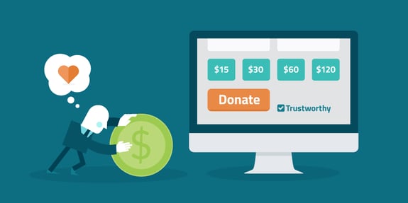
It’s important to understand your audience and how much they’re willing to give, and then motivate them to give a little more by using suggested dollar amounts that are ever so slightly outside of their comfort zone. The most common web donations, when not influenced by outside forces, are in dollar amounts of 10, 25, and 50. By bumping suggested amounts to 15, 30, and 60 you’re subconsciously nudging potential donors toward opening their wallets a little wider, and capitalizing on that nudge is just a click away.
You may have also noticed certain nonprofit donation pages that have suggested amounts in the thousands. While the likelihood of receiving such large contributions through online portals is low, it again encourages the donor to consider the bigger picture and maybe feel a bit more philanthropic. They may be curious to know who else is donating thousands of dollars to this particular cause and now begin to wonder if that five dollar investment they came to the site looking to make should maybe be 10, 25, or even 100.
2. Details make all the difference.
Small tweaks can yield big results. It’s important to pay close attention to how every little change affects donor conversion. According to a study by nonprofit solutions company Blackbaud, donation pages that fail to undergo rigorous testing and optimization before going live wind up transforming less than 15% of visitors into contributors. Here are a few small tips to increasing contributions through your nonprofit’s online donation portal that can go a long way:
- Including trust seals from established legitimacy evaluators such as the Better Business Bureau and Charity Navigator near the top of your donation page can have a profound impact on donor conversion.
- Reduce bounce rates and avoid donor attrition by running a tight (digital) ship. Keep donation forms to a single page to reduce HTTP requests and potential delays, and understand your hosting needs and options before selecting a service so you don’t lose impatient visitors to your site when your next marketing campaign goes viral and makes the Ice Bucket Challenge melt in comparison.
- Always include the option to turn a one-time donation into a recurring monthly contribution. It doesn’t hurt to ask (nicely)!
3. Appeal to the heart, not the head.
What if I told you that AIDS has killed 36 million people since cases were first reported in 1981, and that more than 2 million people a year are being infected with HIV every year? That $30 donation you were planning to contribute to AIDS research seems pretty insignificant now, doesn’t it? Now say I told you there was a little girl in Uganda named Sarah who was born with HIV because her mother couldn’t afford the health care that could have prevented the transmission of the disease during childbirth. Let’s say that although it’s too late for Sarah now, her mother is pregnant again and with your $30 donation Sarah’s mother could afford to travel to a facility that could provide adequate care and the proper medications to help Sarah’s brother or sister live a happy healthy life. That $30 seems well-spent now, doesn’t it?
Sometimes too many facts can detract from a potential donor’s willingness to give. With more knowledge of the cause they’re looking to help, potential donors may be overwhelmed by sheer numbers. Appealing to a specific story can empower the donor to feel connected to the cause, and is much more likely to convert them from a one-time donor to an advocate willing to help a nonprofit reach its long-term goals.
No matter what the goals of a specific donation page may be, it’s important to understand where a visitor is coming from, what their thought process is while on the page, and how you intend to keep them in your corner long after the donation process is complete. Kyle Rush understood this back in 2012 and helped him land his friend a pretty sweet gig.