Make Sure Your Website Structure is SEO Friendly — 5 Tips for Success
 TANK New Media
|

If Your Website is SEO Optimized You'll Get More Traffic and Interested Visitors.
The structure of a website is much like that of a house. A solid house structure improves stability, use, and confidence. A solid website structure increases these qualities as well.
If you own your website, you need to also own your website's structure. Why is site structure such a big deal?
The structure of your website has a huge impact on the user experience, and the potential search engine success of the site. From site structure to navigation to content, let's consider best practices for optimal website structure.
In this post, we'll evaluate the following items:
- Great SEO Performance Starts with Site Structure
- The Value of Breadcrumbs & Link Juice
- Make Webpages Load Quickly
- Optimize Your Website's Navigation
- Write for Readers (Not for Search Engines)
Great SEO Performance Starts with Site Structure
A well-organized website is intuitive and easy to use. It provides all users with a clear delineation and organization of content.
A website with a solid structure will naturally guide a user to the information and on-site actions the site host wishes users to take.
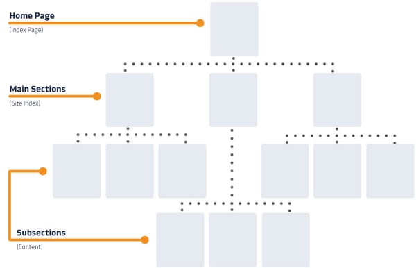
According to Google Webmaster Guidelines, your website should "have a clear conceptual page hierarchy."
The visual below is a representation of the direction your site should take.

This illustration is an example of what's known as siloed webpage architecture. We've essentially created site sections.
To further illustrate this benefit, a well-organized site often causes visitors to look at more pages per visit.
What's that metric?
Pages per visit is a web analytics metric you can track using Google Analytics.
Increasing your website's pages per visit metric can have a direct correlation with Google search engine rankings. Google has been known to observe the dwell time (a metric that can reflect a strength in pages per visit) as a ranking factor.
You see, when a user from Google's search engine results page (aka SERP) enters into a website, their length of visit before hopping back out to SERP can reflect a value in the website's ability to satisfy the user's interest.
So, it's important to optimize with this metric in mind.
One way to ensure your website is structured for the long-click is to get your site architecture right from the start. Ensure your site plans allow for structured site sections that are logical in nature and appealing to your potential audiences.
Giving your website the above organizational advantage will further allow you to make a smart play on your internal linking strategy. What do I mean by that?
When you create topically-specific site sections — or silo your webpages — you can more naturally produce links to other pages relevant to that particular topic.
This works for e-commerce, lead generation, blogs, and information or branding sites.
The Value of Breadcrumbs & Link Juice
As discussed above, there's a real benefit in keeping topically similar information in close proximity throughout your website structure.
The relevancy of information between pages discussing similar topics allows what is known as link juice to flow from page to page.
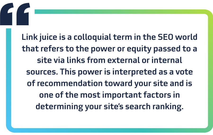
Ok, so, wait. What is link juice?
Our friends over at WooRank define it this way:

Again, solid site structure is great at serving both human and search engine bot users because it's smart, sound, and logical.
Once you have structured your website content into silos and you have identified your ideal customers' language, you'll be in a great position to use the SEO-friendly convention of breadcrumbs.
Breadcrumbs are a type of secondary navigation that gives users a helpful sense of where they are within a website. They are, again, a wonderful way to serve humans and search engines at the same time.

It's a simple convention that can have a big impact. Breadcrumbs force your website builders, be it IT or marketing teams, to really come to terms with site structure. They also give prominence to site hierarchy.
Breadcrumbs force you into having a clean and logical site structure. You can't as easily have a sloppy site structure and still do breadcrumbs. So, request your site building teams to implement breadcrumbs.
This next point is a creative take on structure. However, I'll argue that the structure of a webpage is both impactful and a potential performance differentiator.
Make Webpages Load Quickly
Your pages need to be built to load quickly. When you think about building a new website, think about making pages simple and quick to load. Design with performance in mind.
More than ever websites are being called upon to be fast. Modern websites need to account for modern mobility and mobile devices.
And for good reason.
Think of any one of the times you've likely needed to access information while on the go.

How important is it to you to be able to read a Wall Street Journal article while stopping on a Sunday afternoon bike ride at a coffee house in the middle of rural Pennsylvania?
It's important to me. It's likely important to your customers too.
You've experienced something like that, right? You want to access a website while on the go, but it's just not cooperating.
Your website should be accessible to visitors quickly and wherever they are. Keep in mind, customers don't always have access to the highest-speed internet.
Moreover, all too often the tendency is for modern websites to have "all the features." ~ Gimme all the features, please!
In many conversations about building websites you'll hear statements like these:
- Mobile is important. We need speed. Gotta have quick loading, small footprint pages.
- Video though is great, too. Rich media. We've got to do video. Put that on the page.
- We've gotta have user data. We're going to have to add JavaScript for user tracking.
- Oh, and make sure our pages are shareable and equipped with social media share thingamajiggies.
- What's up with all of this page content? People don't read anymore; we need more images. For goodness sake, can we get more visuals on this page, please?!
You can see, the desire to keep mobile performance (aka small page file sizes) top of the priority list gets difficult when there are so many demands.
Mobile website performance involves a "less is more" mindset. Can you keep it?
That said, there are ways for us to maintain our commitments to mobile users, small page sizes, and to still provide rich user experiences. Here's how.
- Optimize images via compression & sizing — Image compression, and correct sizing of images make a big difference. Too, these are simple steps to take. (See Google's Developers advice on image optimization practices for more details.)
- From a development standpoint — complied and minified code files provide quicker load times, and are still a relatively simple thing to do. (See Google's Developers advice on minifying resources for more details.)
All of these things impact your page performance, but also the page structure. When you chose to be strategic about your layout and your page sizes you make valuable contributions to the user experience. Your strategy impacts site structure and SEO.
Another area worthy of consideration that can also impact site structure is the website's navigation.
Optimize Your Website's Navigation
While many users may use visual and on-page cues, like calls to action (CTAs), clickable images, and links to travel around your website, many will use the navigation.
Now, it's quite possible that a website will have primary, secondary, and tertiary navigations available to users. Done well, presenting multiple navigation options to users can be an ideal situation.
These, too, are structural components that can improve your website SEO, usability, and overall performance.
For instance, an action-oriented top level navigation, along with a section-specific secondary navigation can really help support site structure and user flow. Many sites may not need this. However, for sites that provide significant amounts of information, a secondary nav may help.
Here are some additional points of consideration to keep in mind as you build around user flow and navigation.
- Use action-oriented language
- Consider user benefits of a footer (directory of links)
- Create both XML and human-friendly sitemaps

Creating a list of footer links, (like your main navigation) means these pages are linked to each of your website's pages (that have this footer).
A sitemap can do wonders for optimizing the structure and accessibility of website pages.
It's probably worth noting that each of your website's pages has authority that is to some degree passed to the pages it links to (both within your site and off-site links). So, it's worth choosing these pages wisely; they will benefit to some degree from link juice.
The final point I'll make on navigational items is that having a human facing sitemap can improve your website's SEO.
It's true that a dynamic sitemap is an even more direct way of communicating to search engines what content is available on your website. However, a human friendly sitemap, again, encourages more dwell time (pages per visit), it also puts all of your website links (within silos!!) into logically organized sections.
It's a user-focused win. And, honestly, today your best SEO (PPC, too) strategy for success is to be conscientious and serve your users. What is in the users' best interest is almost always also going to provide you with the with best SEO benefit.
Which brings me nicely to my final point . . .
Write for Readers (Not for Search Engines)
There once was a day in time when using keywords alone could win you traffic.
Today, any one of Google's various search algorithms, which can have 200+ signals, can be in play.
While there are things that you can depend on (targeting keywords, onsite SEO, etc.), your best bet is to always put the person you wish to speak to before these things.
Search engines are sophisticated enough today that they can, do, and will reward you if your webpage content speaks plainly and provide a search query solution.
Putting your audience first, in this context, means a list of things — all of which relate to best practices for online content writing.
These include:
- Write simple sentences.
- Write how you speak.
- Use 2-3 sentence paragraphs.
- Know your audience.
- Provide solutions.
- Address real challenges with genuine human-friendly dialogue.
Where to Go from Here
Creating a clean, intuitive structure to your website is a good move for users of all stripes. The more we create website experiences that are well-organized, helpful, and conscientious of users, the more we all win.
I hope you've discovered at least one thing that you can use in planning your own website. If you'd like any further help or ideas, contact us
Keep reading! There's more to learn.
- Defining SMART Marketing Goals for Digital in 2018
- 6 Ways to Freshen Up Your Content Marketing
- How to Use Video in Your Modern Day Marketing Strategy
- How to Target B2B Customers with Social Media
This post was written by Chris, SEO Strategist, and originally appeared on invoqmarketing.com. Invoq Marketing Company was acquired by TANK New Media in 2018.
Subscribe to Our Blog
Stay up to date with the latest marketing, sales, and service tips.


