If there’s anything you can count on other than death and taxes, change is inevitable. Over time everything evolves; seasons change, trends change, and businesses change. We often hear from businesses whose branding and website need to be updated to represent the current state of their business, product, and audiences.
Maybe their product lines have changed, or their business structure has; sometimes, they have just outgrown their current website or brand and need something different. Keeping your branding fresh and relevant is a constant, ongoing process. If your marketing feels off-target or stale, refreshing and trying new tactics can have powerful results. This was the case for a client we worked with called Phoenix Energy Solutions.
They are well-established, and their business plans have changed and outgrown their existing brand and website. They needed a mark that spoke to their updated brand vision, which is as follows:
“Phoenix Energy Technologies balances the power, efficiency, and scale of technology with customized coverage of expert client services teams to ensure our customers get the greatest value from our energy management solution.”
When creating its brand, Phoenix Energy Technologies wanted to be seen as a forward-thinking, proactive, and technologically advanced solution for data-driven energy management. The mark and brand needed to feel modern and technical while giving the nod to energy and sustainability.
Unleashing Your Uniqueness
Communicating Company Differentiators for a Competitive Advantage
To start the project, we spent time with their team to understand their customers and how they helped solve their problems. We worked together to complete an updated branding positioning framework. This framework communicates its mission and vision. The possibility for design-driven growth is impressive, but they are essentially about what and why they do what they do.
This framework also helps us define their commitments or value propositions. These are the core benefits or features that not only help them stand out from their competitors but help solve their customer's problems in a way only they can.
We made sure we also had clear documentation about who their customers are and what industries they are actively involved in. These help ensure we know who we need to resonate with. Staying laser-focused on the target audience and positioning help present a clear and understandable brand.
From Concept to Reality
Focusing on Core Concepts To Build a Strong Brand Identity
With these core positioning principles defined, we had the baselines needed to start working through creating a visual and brand system that came into alignment seamlessly.
Knowing the direction Phoenix Energy Technologies wanted to take for their brand — forward-thinking, proactive, and technologically advanced — we started working through brand redesign concepts that took their direction and included their unique positioning and differentiation.
We explored a variety of focuses — connection, energy, technology, sustainability, and innovation to name a few. We worked through utilizing these in a mark with the visual appeal but still communicating their vision.
 The concept driving the chosen logo was based on connected technology solutions, their ability to impact energy and sustainability, and the work they had already done when building the Phoenix brand.
These elements were worked to create a new logo that matched their evolution. This logo accurately represented their ability to manage the balance of power, efficiency, and technology scale with customized coverage of expert client service teams to solve their customers' problems.

A Cohesive Visual System
The Importance of Aligning All Visual Elements
We know for brands to be successful, it goes beyond just updating the look and feel of their logos. We have to thoroughly audit every aspect of their branding and redesign it in a way that will scale seamlessly. And that’s how we’ve designed our structured projects — to deliver a better brand experience built on connected systems that grow with you.
Up to this point, we had established the brand frameworks and created new concepts for the logos. We needed to expand the visual system to include the components we know Phoenix needed to successfully apply their brand to make future marketing and sales efforts consistent, clear, and easy to execute.
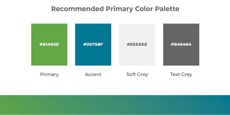
One of the components included in this system is the color palette. The color choices chosen for the brand needed to tie back to the value propositions and unique positioning statement — it needed to have a fresh and technologically advanced feel. The color palette chosen helps evoke the right emotions and values. Including the gradient in their color palettes provides a sense of energy, giving the brand movement.

We also looked at how we could create a series of branded graphics, icons, and templates that could be used to create supporting imagery in branded materials. This takes the styles approach from the logos and expands the visual system in a way that still reinforces their values and positioning.

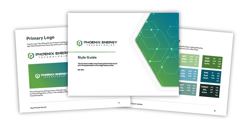
We created a brand guide to ensure future teams and partners could leverage the Phoenix brand accurately. This enabled their internal marketing team to seamlessly execute the brand update on already created collateral and future efforts.
Rising to New Heights
How a Refined Visual System Elevates Business Success
Having a brand that accurately and uniquely represents your business is the foundation you need to be ready for future growth. Our structured projects created a unified brand system for Phoenix Energy Technologies that aligned with their current business vision and goals. Don’t let your brand hold your business back. Let’s talk about your business and uncover the efforts you can take to take your brand to the next level.


