Equipment manufacturers need modern websites to increase brand awareness and build their customer base.
Maruka USA (Markuka) was established by its parent company, Maruka Machinery Co., out of Osaka, Japan, over 50 years ago. With nine offices in the United States, Maruka USA is a distributor of metal cutting, plastic processing, and fabrication equipment.
If they were going to beat the growing competition, Maruka knew it was time to update their website. They needed a responsive version of their current website. The site needed to be easy to navigate, clearly communicate Maruka’s unique selling proposition (USP), and assist in lead generation for their sales team.
Persona-driven website that communicates a unique selling proposition and assists in lead generation
Maruka chose to partner with the team of marketing and website experts at TANK New Media (TANK) to navigate the massive website undertaking.
To start, TANK recommended persona development and user research to further understand Maruka's target audiences. This would help to uncover demographic information, important buying practices, needs, goals, and key messaging that would connect with their target audience. A full audit of Maruka's existing materials and the competitive landscape helped TANK gain an understanding of where Maruka was positioned in the marketplace and how potential opportunities could be identified.
It was essential to Maruka that the site design fit their industry, audience, and brand, positioning them as the industry experts. Because Maruka was a machine distributor focused on selling and servicing their machines, their website needed to be an effective sales tool. They wanted their site to attract new customers, assist in closing sales with compelling product pages, and showcase their services.
Because of their focus on sales efforts, they had different promotions running simultaneously. To be optimally helpful and avoid any potential confusion, TANK created a section on the site to promote special offers and services as well as news and events that could be easily changed to accommodate the shifting priorities.
Visually compelling website that’s easy for users to navigate
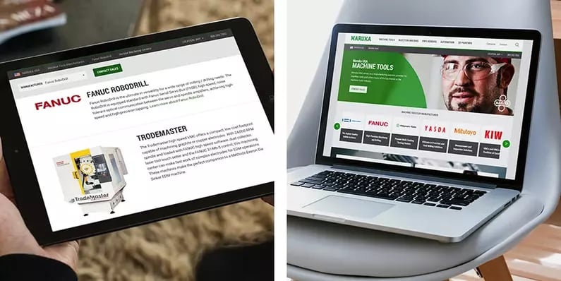
TANK designed the site to evoke a professional, enterprise-level quality using machine images and a green and gray color palette to complement the company's existing brand and logo color. Maruka's previous website lacked structure and cohesive navigation, so it made sense to leverage the Craft CMS to help provide organizational structure and content management. By utilizing an intuitive and structured CMS, Maruka's site administrators could avoid extensive and complicated development training in order to maintain the site after launch.
The site's pages used modular elements, which made it easier for site admins to create and adjust pages on their own, without the need for unique design templates, making the website manageable without coding experience.
Maruka's new easy-to-navigate website helped prospects learn about the brand, machine options, and next steps. In the product sections, visitors could dive into the various machine options available in their area.


Strategic website revamp lead to improved website engagement and higher lead conversion
TANK revamped the website's visual presentation, created a new, intuitive sitemap, or site architecture, and implemented a stylized theme across the website, which led to improved website engagement and higher lead conversion. The strategic use of machinery photos on the home page, service pages, and the project gallery helped create a cohesive and compelling experience.
Once vital website pieces were in place, Maruka added new product lines and services to their site, confidently knowing it would look great and align with their industry, audience, and brand, positioning them as the industry experts.


