A complete website redesign solidified and strengthened the reputation of a custom retail display manufacturer.
InStore Design Display (InStore) is a manufacturer committed to creating high-quality custom display and retail elements for retailers and product brands.
As their business began to experience a transition in the early 2000s, the core focus shifted from stock fixtures to designing and building custom displays and retail environments. Due to this evolution, a confusing message developed in their marketplace. InStore discovered that many of their customers still thought of them as a stock fixture company when, instead, they wanted to communicate their ability to create innovative solutions to problems that resulted in exciting and engaging custom displays for retailers and brands.
That's when they reached out to the team at TANK New Media (TANK) for a cohesive and consistent brand image. This project started as a logo redesign and brand refresh. Both worked together to create a story that represented everything their business had to offer — it was a visual system that symbolizes their ability to create custom and innovative solutions. This renewed story and corresponding visual assets gave InStore's internal team a mission to believe in, resulting in re-energization across the company.
With a solid brand foundation in place, it was time to modernize their web presence. The InStore website not only needed a visual update but a redesign that could bring three separate sites and their audiences under one roof. InStore partnered with TANK to assist in a website redesign on the HubSpot CMS in addition to an implementation of the HubSpot Marketing and Sales software.
A broad range of experiences conveyed simply so that any audience could understand
Since multiple websites were merging underneath one roof, it meant various types of messaging and content had to be reorganized to provide one seamless brand experience for all InStore audiences. This started with a complete content strategy overhaul. Website content needed to help define the InStore brand and connect rationale to emotional benefits. TANK worked diligently to align headlines and copy from the positioning framework created during the branding process, including a consistent tone and personality.
TANK also wanted to ensure the website redesign included a structure that was intuitive and easy to follow so users could search and find solutions quickly. This meant page designs needed a combination of descriptive copy that offered solutions to problems as well as visual examples of InStore’s innovation work.
For example, on many of the InStore services pages, it was helpful to showcase the InStore design process. By utilizing tabs, a step by step overview of the design process was provided. Each tab used content to describe what was accomplished and an image to show the product concept.
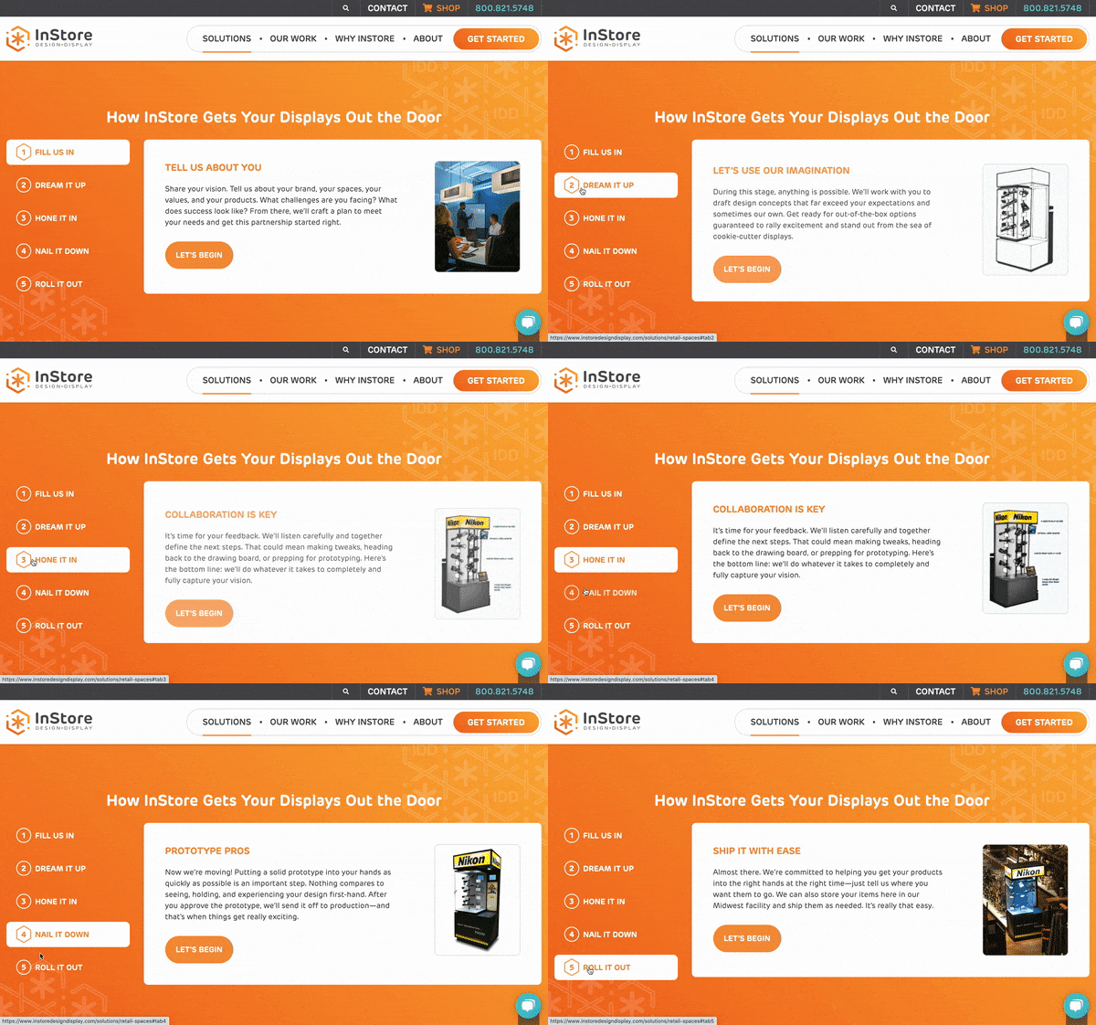
Making improvements to the site architecture, design layouts, and content helped create a better user experience for every audience.
The redesign created seamless experience between the branded website and e-commerce functionality
InStore had an e-commerce website featuring stock fixtures that was already up and running; it just needed a little freshening up. During the website redesign, it was essential to provide an easy way for users to get back and forth from both sites seamlessly. Moreover, it was critical that once users were on the stock fixtures e-commerce site that it felt like an extension of the InStore brand.
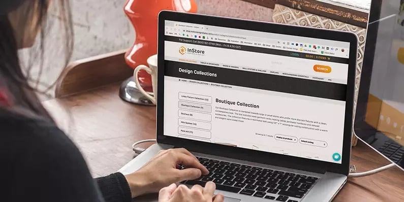
TANK worked with the InStore team to create a custom navigation and footer for each of the sites, using the same design and branding. This allowed users to jump back and forth between the two sites while still experiencing consistent site navigation.
In addition to the custom navigation, the e-commerce site also went through minor visual updates. While much of the core structure and product information was kept as-is, TANK updated fonts, colors, button styles, and more to create a seamless brand experience for InStore customers.
Solid and consistent branding led to an exceptional website redesign
Because TANK spent time with the InStore team to create a brand and visual system that extended far beyond just a logo redesign, each piece would be used strategically throughout the website redesign.
By leveraging the updated color palette, TANK was able to create a renewed energy throughout the site. Emulating the excitement and energy the InStore team has when working with partners to make products and retail spaces stand out from the competition. The custom pattern created for InStore was used throughout the website for brand cohesion, and the custom icons enhanced product photography.
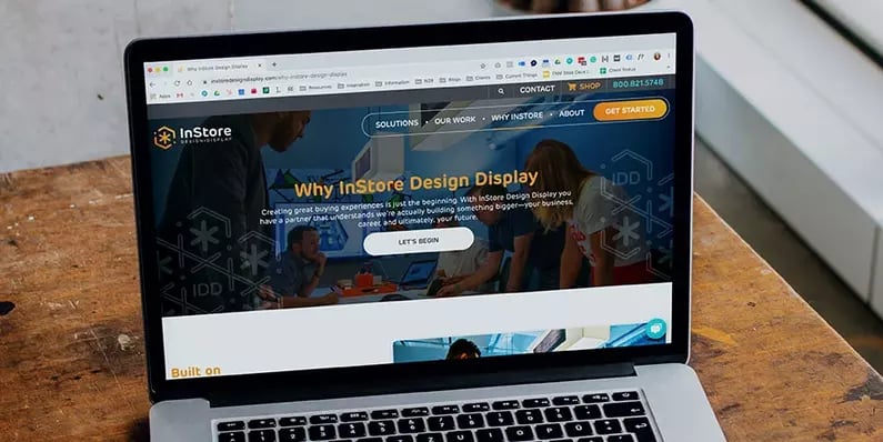
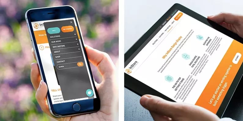
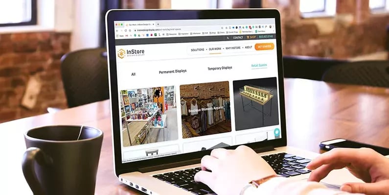
TANK also created a section on the website to showcase InStore's custom work. The work section was built out as a gallery so users could see an overview of the InStore team's capabilities. Filtering functionality was added to enable audiences to sort by the work type relevant to them. The gallery pages linked to detail pages to provide more information without cluttering up the gallery listings. The detail pages had the flexibility to display additional images, concept sketches, project background, process, and results.
TANK started the brand project by focusing on the motto, "There's more InStore." From there, the brand story developed, the logo and icons evolved, and a complete branding system was born. All of this led to a website that better aligned with InStore's mission and abilities to provide clients with custom and innovative solutions, ultimately positioning them competitively within the industry and leading to profitable growth.


