Focusing on your brand can drive competitive advantage and profitable growth across your organization. Sometimes that means a complete rebranding.
The Need for Rebranding
Overland Resource Group (ORG) is a consulting firm with over 30 years of experience in numerous organizational transformations, resulting in remarkable performance improvements.
They came to us in need of rebranding that would effectively communicate the dramatic difference ORG can provide organizations by utilizing collaboration. In order to reach their audience and accurately communicate their mission and personality, they needed to refresh their branding so that it was contemporary and on point.
Our task was to create a brand redesign that felt balanced, easy to understand, and could appeal to every level of their target audience. For them, that meant creating a design that entire companies could relate to — from employees to management to c-suite executives.
TANK worked diligently with the ORG team to create an experience that communicated professionalism and their core value of collaboration while remaining approachable, personable, and relatable from multiple viewpoints.
Our Approach to Rebranding
We approached the rebranding process by asking: What sets ORG apart from their competition? In other words, what makes them different?
Their focus is on the human element of companies, not the data, numbers, or spreadsheets. ORG believes that people are one of the greatest assets of any company. Collaboration is critical at every level for an organization to reach peak performance. And the result of these collaborations – not only internal collaboration in organizations but a partnership with ORG as well – are massive transformations.


We knew we had to reinforce the idea of collaboration through the entire rebranding, but we also wanted to build on the style principals — strong, personable, simple, and clear. Our exploration led us to a variety of ideas; many developed from the strong notion that the mark should show multiple parts are coming together or being connected in some way. We fleshed out these looks further to see what concepts felt balanced and sophisticated yet approachable and personable.
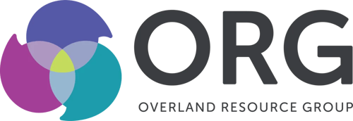
The mark we landed on showcases three stylized speech bubbles coming together accompanied by a custom logotype. The logo gives a subtle nod to how ORG creates success — they bring all ideas, voices, and perspectives together to create maximize results.
Rebranding is More Than a Logo Redesign
Rebranding is more than a logo or symbol. It’s the creation of an identity that consumers, investors, and stakeholders can personally connect with; it's about making an essential emotional connection. That’s often done through visual mediums. That’s why we think beyond the logo, and we consider the colors, font types, icons, image, and more.
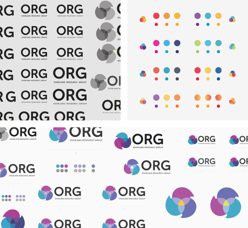
Humans are drawn to color, and we’re affected by it emotionally. For ORG, we selected a color palette composed of bold and impactful primary colors with a supporting color palette that is softer and more approachable.
The ORG color palette helps communicate confidence without being overly flashy. It was important as we built out the brand system, that we focused on ensuring every part of the brand felt approachable and personable.
![]()
We chose a primary typeface with rounded corners that allows the system not to feel too rigid, and we built the expanded visual system such as icons and supporting graphics with subtle curves and rounded corners to emphasize ORG’s relatability and approachability.
The rebranding helped ORG to align the look and feel of the company with its values and goals. Their focus on collaboration is now communicated through multiple touch points of the brand. They have a consistent and cohesive visual system across marketing and sales. And now they also have a rock-solid brand foundation that positions their organization for future growth.
Need help with your rebranding efforts? We’re here to help! Take a look at our branding and design service or start a conversation to see how your brand experience can be taken to the next level.


