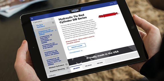
A leader in American-made hydraulic components, Cross Manufacturing needed a website that could support and promote their mission.
Established in 1949, Cross Manufacturing (Cross) has a long history of producing one of the most extensive hydraulic component lines in the market today. Over time, Cross has diversified its product line to meet the growing demands of additional applications, including material handling, drilling, construction, marine, mining, forestry, and other specialty markets. Cross's customers consist of three primary audiences: distributors, OEMs, and stores/dealers. These audiences sell Cross products directly to the public or use them for their own machines.
To promote their mission, stay ahead of the competition, improve website traffic, and increase lead generation, Cross knew they needed to update and enhance their online presence, specifically building a user-friendly and dynamic website. Cross chose to partner with TANK New Media (TANK) for their website design and development project because they trusted TANK’s site building expertise.
During the strategy phase of the project, TANK uncovered several opportunities to create great user experiences while catering to each of Cross's target audiences.
TANK's first task was creating a responsive design for the new website. The old site was not built to be mobile-friendly — but with Google favoring responsive design and the rising demand for mobile accessibility in the marketplace by B2B buyers, it was a necessity.
Next, because Cross had an extensive library of technical information and machine specifications that needed to be easy to find, site organization was paramount. The old site featured three separate navigations, which created a confusing structure for users. These navigations needed to be combined, simplified, and streamlined to be intuitive for users.
Clearly, the website's design, architecture, and navigation were the most significant opportunities for growth.
Stores/dealers rely on Cross's website to determine what parts they need and which are available for ordering. This online process was complicated and confusing. Since there are 24 product lines on the site, with anywhere from 1-5 variations of one product within a series, there needed to be a better way for website visitors to see all the options then access more detailed information for the specific products of interest. And, for end-users, they needed to know how to find and contact a Cross distributor.
Cross also provided custom products for OEMs that could be privately labeled. However, this was not addressed directly on the site and caused OEM customers to look for alternative options. These users were not treated as a different audience with different objectives. The buying process that worked for Cross's other audiences didn't work for this audience. To fix the problem, TANK created a pathway specifically for OEMs and their needs. Clear and clickable callouts functioned as indicators for finding appropriate content, leading this audience to relevant next steps.
A branded website that provided a complete product narrative and easy search capability
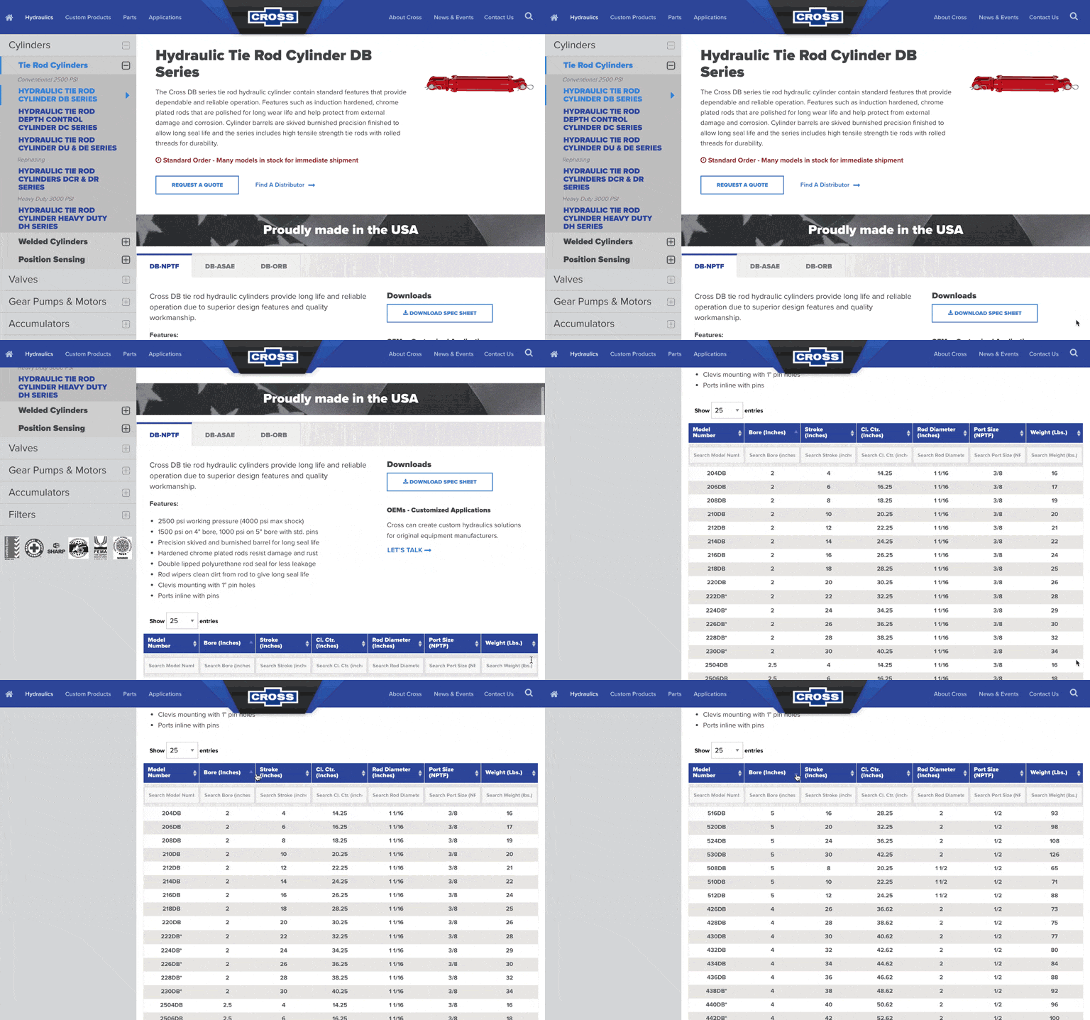
TANK worked with Cross to understand how each product line was structured and how they needed to work together to provide a complete picture and the best user experience. TANK made the primary navigation simple and straightforward, directing visitors in the right direction at a glance. Each of the product lines featured an expandable sidebar navigation structure that included the breakdown of each product and the variations available. The on-page sidebar navigation provided a way for users to filter by specific products or parts quickly and conveniently.
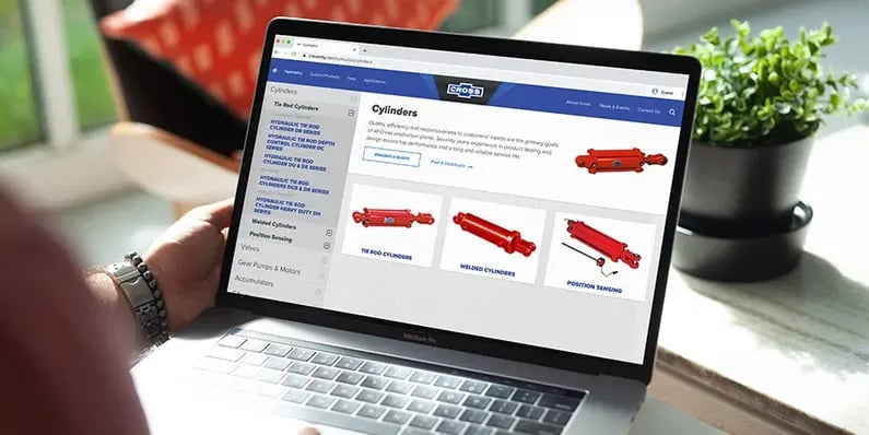
Product and part pages also got a structure and layout revamp. These pages needed to showcase product lead times, content spec sheets downloads, features, highlights, and corresponding model variations.
TANK built a fully customized and searchable table functionality to help users easily locate the specific details for each product and part. For example, customers could search for a product based on its model number, particular weight, or specific bore size without leaving the page. Bold and clear call-to-action buttons guided visitors to next steps.
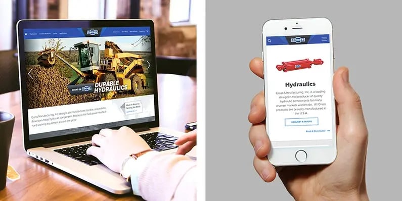
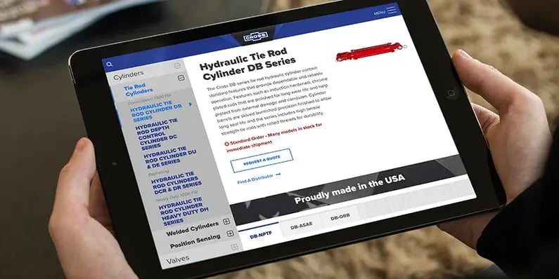
The TANK team made sure all these site enhancements and improvements transposed to the mobile experience without a hitch. Information was appropriately truncated and structured in a way that provided mobile users with the same seamless experience as desktop users.
Table functionality was tested and developed to ensure the mobile performance of specific actions like swiping through the table data and entering product search details was smooth and intuitive. The rebuild of the site navigation and site architecture made drastic improvements to the mobile experience as well. Information was structured logically, making it easy for visitors to understand where to locate specific information and how to work their way through different sections of the website.
A website that provided a clear and cohesive structure for easy navigation
TANK revamped Cross’s visual presentation sitewide, including the home page, product pages, and the part pages. All made strategic use of content, layout, and design. Now almost every key element on each page is cohesive, logical, helpful, engaging, and easy for users to use. These changes quickly impacted the number of inquiries among their three primary audiences.


