An early education and social service center needed an upgraded website design with better functionality.
Since 1971, Operation Breakthrough has grown into the largest single-site early education center and social service facility in the state of Missouri, caring for nearly 650 children every day in the urban core of Kansas City.
In addition to early childhood education and social services, the center provides before and after school care, food, clothing, diapers, on-site medical and dental care, and therapy. For the children's parents and caregivers, the center provides programs and case management.
Operation Breakthrough has recently gone through significant improvements to modernize and expand its facility to serve the children better. They added a new creative space for the children where they can learn to sew, build, and create, learn valuable problem-solving skills, and creative skills to help put them ahead of the curve.
With the building upgrades in place, it was time to focus on their website.
An upgraded website to collect donations and offer higher value to visitors
Like the facility, Operation Breakthrough’s website needed some major updates to keep up with the needs of their growing organization. Their current content management system was no longer supported, making it nearly impossible to update the website, the site architecture was hard to navigate on mobile devices, and content was stagnant. The site was no longer adding value to the Operation Breakthrough brand. All of this was resulting in lost opportunities for online donations and community involvement.
A branded and restructured website to provide flexibility and a better user interface
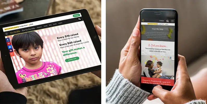
Operation Breakthrough partnered with the team at TANK New Media (TANK) for a website redesign. TANK restructured the website on an integrated system that offered flexibility and leveraged high-quality assets to help tell the Operation Breakthrough story.
During the strategy phase of the website project, TANK discovered that Operation Breakthrough had a library of photos and videos that helped tell their story. These assets were used throughout the new site to help make a personal connection, increase engagement, and inspire action.

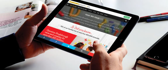
The website was restructured and rebuilt from the ground up on a more flexible content management system called Craft CMS. TANK also simplified several technical integrations to streamline their processes, so the new website is easier for the staff to maintain and keep current. The photos and videos peppered throughout the site now accurately represent Operation Breakthrough's brand and mission. The new responsive design allows users to easily donate, sign up for events, read success stories, and register for volunteering regardless of what device they are using.
In addition to streamlining design and content, there were also several technical factors that needed to be considered. There were a variety of separate platforms being used regularly for functions such as volunteering, email marketing, and e-commerce. Due to the complexity and number of systems, TANK recommended an evaluation of their organization and communication platforms and goals. After finding the right ones, a simplified and integrated approach was implemented to ensure all tools could work together in harmony.


A website that communicates and aligns with the organization messaging
The redesign resulted in "a dream come true" for Operation Breakthrough. They now have a site that draws in people, is easy to navigate, can be updated as needed, allows volunteers to register, and donors to give — and it all aligns with Operation Breakthrough's incredible mission.
Since launching the new website, Operation Breakthrough has received positive feedback from all fronts, including the board of directors, employees, volunteers, and, most importantly, the Kansas City, MO, community.
"If you ever want to work with people who are confident about what they do... you need TANK New Media." - Lee Duckett, Associate Director of Marketing and Events


