A shed manufacturing company in South Dakota needed a website overhaul — the result was a 49% increase in contacts.
TANK New Media (TANK) and Dakota Storage Buildings (Dakota), a midwest shed manufacturing company, have been partners for years. In 2015 partnered with Invoq Marketing to implement HubSpot's marketing platform, so that Dakota's inbound marketing and sales efforts could align for maximum impact. During 2018 TANK acquired Invoq Marketing and continued to partner with Dakota to drive marketing and sales growth. In 2019, TANK refreshed and modernized Dakota's branding and logo. The redesigned branding was done to reflect the company's mission and commitment to quality materials, expert craftsmanship, and superior customer service.
After the brand refresh, TANK updated Dakota's website to leverage the new brand elements, creating a dynamic and cohesive experience for site visitors. In addition to Dakota having HubSpot's marketing platform, their website was built using HubSpot CMS, which made branding updates across platforms effortless.
As Dakota added new products and expanded previous lines, they wanted their website organized in a way that showcased all their products within the various collections and series categories.
Product Pages
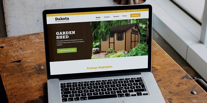
Because TANK knew that Dakota's product detail pages have high traffic, they reviewed the page layout and made updates to improve user experience. The new page layouts provided a complete picture of Dakota's products. Customers were given access to information that would help them make decisions and understand the buying process. Each product page had images of the building, information about how they were built, key features, examples of use case scarious, and building configuration options.
Once the product detail pages were upgraded, the TANK team focused on product listing pages to improve usability. For example, a listing page was built for the Standard Shed series, a collection of popular designs and use-cases. It featured tabbed functionality that allowed users to navigate through options within the series. These changes helped increase contacts by 49%*, and Dakota saw a 94% increase in the number of deals closed** (May 2019 vs May 2020).

In addition to these changes, TANK proposed an update to the site navigation. The previous navigation featured a simple product list. Creating a mega navigation helped users quickly see the different series options available, along with a visual example and a clear call to action. By providing a better visual layout of the product options available, users could get to the products they were most interested in faster. Website enhancements like these have led to an overall increase in the average transaction by 5%***.


Location Section Update
Many of Dakota's customers prefer to view products — sheds, garages, coops, and kennels — in person before completing their buying process. Therefore, it was vital that TANK create a way for customers to access display lot location information quickly and easily. To ensure the website's display locations section was providing visitors with accurate, relevant, and useful information, TANK worked through updates to improve that usability and functionality.
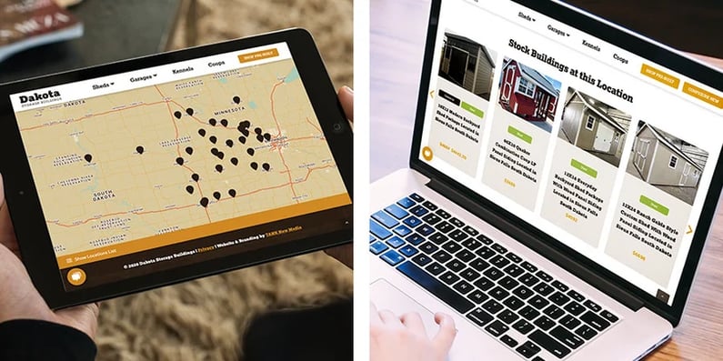
TANK built an interactive overview map of all the display lots on the display locations listing page. Because Dakota is consistently adding, removing, and changing display lot locations and information, this section was built using the HubDB in the HubSpot CMS, making updates to display location pages easy while maintaining an excellent front-end user experience.


Along with the locations listing pages, the location detail pages were revamped as well. The details pages were designed to not only answer frequently asked questions about display lot locations but also to promote the stock inventory for purchase at each lot. This helped Dakota appeal to customers interested in buying pre-built buildings.
Mobile Experience
Dakota’s audience likes to browse products while on the go and when they need to find the nearest display location in real-time. To ensure the mobile audience was getting what they wanted, TANK worked to improve the mobile experience, ensuring that information was truncated to simplify long pages and shorten scrolling time. This was done by stacking information in a way that guaranteed an effortless flow — the aim was for mobile viewing to be as effortlessly as desktop viewing. The display locations section was designed for users to easily navigate from a display lot location page back to the overview map.

While Dakota is among the best in the midwest at designing and manufacturing high-quality buildings and providing superior customer service, with the updates TANK made, they also have a solid marketing foundation and even stronger website presence.
By approaching vital branding updates systematically through TANK’s strategic growth programs, the website experience is continuously improved over time based on how customers are interacting and as business needs evolve. This process ensures the Dakota brand aligns with their mission and connects with their customers and target audience.


