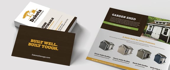
A shed manufacturing company needed a brand refresh to help customers visually connect their premium products with their reputable values.
Dakota Storage Buildings (Dakota), a midwest shed manufacturer, has always been dedicated to excellent customer service and quality craftsmanship. Anyone who knows the “Dakota name” knows it represents top quality and exceptional customer care. But not everyone grasped that message by simply browsing their website or flipping through their catalog. Somehow they needed to connect the dots for new and potential customers. Dakota knew they could grow their audience and increase sales if they could communicate their messaging clearly, effectively, and in a way that built an emotional connection.
This became even more critical as they looked into introducing new product lines while continuing to grow their existing ones. It became apparent that their website, branding, images, and messaging needed to communicate their mission better, meet their customers' expectations, and grab the attention of new buyers. Continued misalignment would result in disjointedness and prevent potential growth.
Dakota’s branding and logo needed to be updated and expanded to create a visual connection and appeal that would resonate with their target audience and position their company for growth. The top-notch service they provide for their customers and their commitment to high-quality products make Dakota stand out from the competition — now, it was time for their branding to match their stellar reputation. The world needed to see what so many already knew.
Logo
TANK New Media (TANK) started the rebranding process with minimal but high-impact tweaks to their logo. These adjustments improved legibility and modernized the look immediately while still honoring the former logos’ foundational characteristics.

Updating the entire visual system, including the new logo, updated color pallet, refreshed website pages, and more, was accomplished through a phased and flexible rollout. Leveraging a phased approach allowed TANK to build on Dakota’s already strong brand equity — the trust behind the name that their customers have come to recognize, respect, and expect. Utilizing an adaptable rollout allowed company assets such as display lot building signage, company apparel, vehicle decals, letterhead, etc. to be updated incrementally. A well-time rollout helped with budgeting and workload, and it gave customers the opportunity to acclimate to the updates.
Sales & Marketing Assets
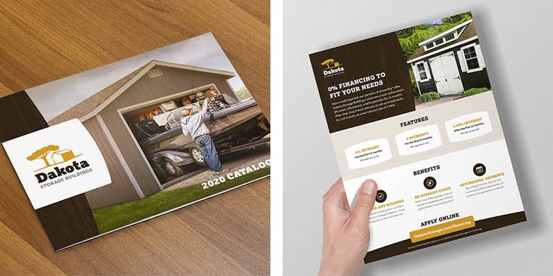
When the TANK team focused on Dakota’s sales & marketing assets, they looked critically at high-impact collateral like the annual product catalog and essential digital components like branded email templates. Each was revamped so that they seamlessly tied together. For instance, if a potential customer saw the catalog and received an email from a sales team member, they would know instinctively that both were from Dakota. Uniting brand elements like logo, colors, photos, graphics, and content on all channels helps customers to make essential connections and increases brand trust.
Because Dakota is committed to upholding their core values, all branding and associated assets must work together to help communicate this fundamental mission. While this helps to build trust in the brand, it also reveals inadvertently their desire to be approachable and helpful.
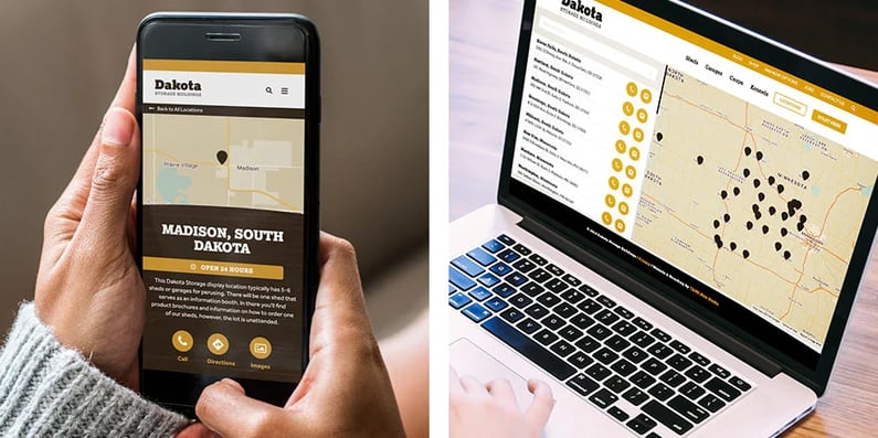
Additionally, attention was given to high-traffic pages such as product listing pages, product detail pages, and display location listing pages. Focusing on these specific page templates allowed the process to move quickly while instantly improving the user experience and having the flexibility to work on new pages for additional products. Ultimately, these changes combined helped increase contacts by 49% and Dakota saw a 94% increase in the number of deals closed.

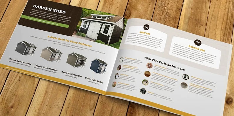
The listing pages or overview pages categorize building types. For example, the Standard Shed series is a collection of popular designs with common use-case scenarios. The tabbed functionality of the layout allows users to navigate through a variety of package options within the series. Clicking through to the package page gives visitors a complete picture of the building offered, including how the product is built, its key features, examples of use cases, and a link to customize the package. Agile website enhancements like these have led to an overall increase in the average transaction by 5%.
Product Line Expansion
As Dakota started to explore the addition of new product lines and building types, the TANK team recommended a refresh and expansion of the existing color palette. This would not only breathe new life into the lines, but would provide a better experience for users both online and in print. For example, every package in the Shed Collection is branded with the color “Grass” or green in print collateral and online product pages.
Creating color associations helped to differentiate collections but also grouped similar items together for easy visual identification. This expandable system offers room for continuous growth as product lines expand in the future.
Additionally, the modernized color palette and updated brand graphics were leveraged to accentuate call-to-actions, shed specifications, and other relevant information making it easier for users to see key details and next steps.
Getting continuous positive feedback from customers confirmed to Dakota that they made the right decision to align their branding and online presence with their stellar reputation.
"... From start to finish, working with Dakota was a breeze. After designing [my shed] online ... we were in the queue for production. The estimated completion date was more than reasonable. The shed was ready for delivery a week early, which was great. ... You can tell they know how to knock out a quality product!" - Richard Willis (Facebook)
"What a great experience from start to finish. Excellent customer service all the way to the end. I would recommend them any day. We are going to love our new shed!" - Susan Haas (Facebook)
Dakota will always aim to be the premier brand in South Dakota and Minnesota. It's in their DNA. And while they're the best at designing and manufacturing high-quality buildings and providing superior customer service — some of the characteristics that make them stand up from the competition — they now have a brand image to support their reputation and goals.
With vital branding pieces in place, Dakota can continue to add new product lines and grow existing ones, confidently knowing that their brand aligns with their mission and connects with their customers and target audience — the perfect blueprint for growth.


