With only 24 hours a day, business owners must choose their priorities. Streamlining their production efficiencies and improving their sales processes may take precedence over evolving their website updates.
Your focus should be ensuring you deliver quality products and services quickly. However, your branding and marketing materials — including your website — help you connect with new customers. Without regular updates, you might find that your website no longer accurately represents your brand.
After 15 years in business, this happened to Phoenix Energy Technologies. Though their business had grown and adapted, their branding and website had yet to. We’ve worked with Phoenix to create a comprehensive brand identity that matched their goals and visions for the business and then used those guidelines to redesign their website thoroughly.
Laying the Groundwork
Successful Businesses Start With a Solid Foundation for Their Website
One of the biggest challenges that Phoenix Energy Technologies’ website presented was the need for a thorough reorganization. As the business had grown, so had the site. However, new pages were not added logically, and old information was not removed, making it difficult for customers to navigate the site and find the needed information.
Phoenix contacted us because they were preparing to add new products to their software and wanted to update their site to highlight the new features. Unfortunately, because their site needed to follow an organized layout, they struggled to seamlessly integrate their current brand vision into their outdated web pages.
The first step of our branding project was to understand Phoenix’s product and audience. We worked with their team of industry experts to understand how their software worked and how the features they were adding would enhance their customers’ experiences. Then we built out buyer personas for their target market. The buyer personas provided a framework that helped us match their software’s features to specific audience segments.
They helped us identify what problems or pain points motivated buyers to seek out Phoenix’s product and how they could best help them.
Understanding why customers considered Phoenix and the value they provided to each customer was crucial to design a more effective website. Not only were we able to restructure the website to make navigation more intuitive, but we were also able to organize the layout of individual pages better. We understood how Phoenix could solve customers’ problems. Now we just had to ensure that information was communicated in a way that website visitors could quickly and easily understand.
Building a website is like building a house. Once we had a solid foundation and framework in place, we could turn our attention to the aesthetic components of the design.

Staying Fresh
It's Important To Keep Your Website Up-to-date and Goal-oriented
We helped Phoenix develop a consistent and cohesive visual brand identity as part of the website project. These guidelines helped transpose Phoenix’s mission, values, and attributes into visual elements that could easily be reproduced for their website and other marketing materials.
As a software and technology business, Phoenix values innovation and forward-thinking. Therefore, we opted for a bold, energetic color palette of greens and blues to inject new vitality and energy into their site. Green is also associated with energy, specifically sustainability. One of Phoenix’s main selling points is that they help businesses manage their energy expenditure more efficiently. We also incorporated rounded polygons to give the site a more modern feel and webs of interconnected lines to evoke the image of a power grid.
As we’ve discussed, one of the main goals of the redesign was to improve the overall clarity of the website and make it easier for visitors to locate information. People generally process information more quickly through images and videos than large blocks of text. On pages that receive high volumes of traffic, we incorporated more video assets and explanatory imagery to improve customer understanding and improve overall user experience,
Since Phoenix already used HubSpot’s Marketing Hub, we felt it made the most sense to build their website using the HubSpot CMS Hub. This would allow them to integrate marketing tools into their website and run more comprehensive analytics. We opted for HubSpot’s modular-based website-building platform. We worked with the team at Phoenix to identify which modules would help them achieve the look and functionality they were after. The modular-based build helped us customize a website to their needs and ensure easier website maintenance. Instead of working with a development team, the team at Phoenix can make simple and more frequent updates on their own.
Connect And Convert
Represent Your Business Clearly and Accurately With A Website Built to Work For You
Our mission extends beyond delivering a mere digital presence. We craft a website designed to clearly communicate with your audience while doubling as a powerful sales tool that drives results and encourages growth.
We acknowledge that, based on previous experiences, this process may seem overwhelming and too complicated. By diligently refining our approach we have smoothed transitions and eliminated uncertainties. Through our meticulous and streamlined process, we turn the path to a revitalized website into a seamless, rewarding journey.
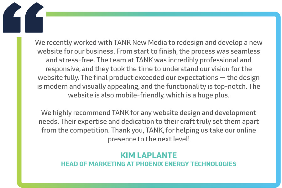
Kim LaPlante, Head of Marketing at Phoenix Energy Technologies, had the following to say:

After their brand and website redesign, Phoenix can connect more effectively with their target audience and accelerate its growth. Do you need help with an outdated website that no longer represents your brand accurately? We’d love to hear about your project. Schedule a call, and let us see if we’re the right fit!


